Chapel of Reconciliation
Listen to my reading this essay aloud:
The reconstructed Chapel of Reconciliation, located along the Death Strip in central Berlin, stands today like no other church space. Residing perpendicular to the Berlin Wall Memorial, the active Protestant church attempts to memorialize the original 1894 structure and its storied history with a landmark design built in 1999 fit for daily, contemporary use. The original church, built long before the Berlin Wall, was blocked off by the wall in 1961, used for its height by Soviet troops as a surveillance/sniper point, and finally exploded to rubble in 1985. Today, the chapel redesigned by Rudolf Reitermann and Peter Sassenroth, with placards explaining the history and the outlined foundations of the building’s predecessor onsite, elegantly bridges that history with modern design and use.
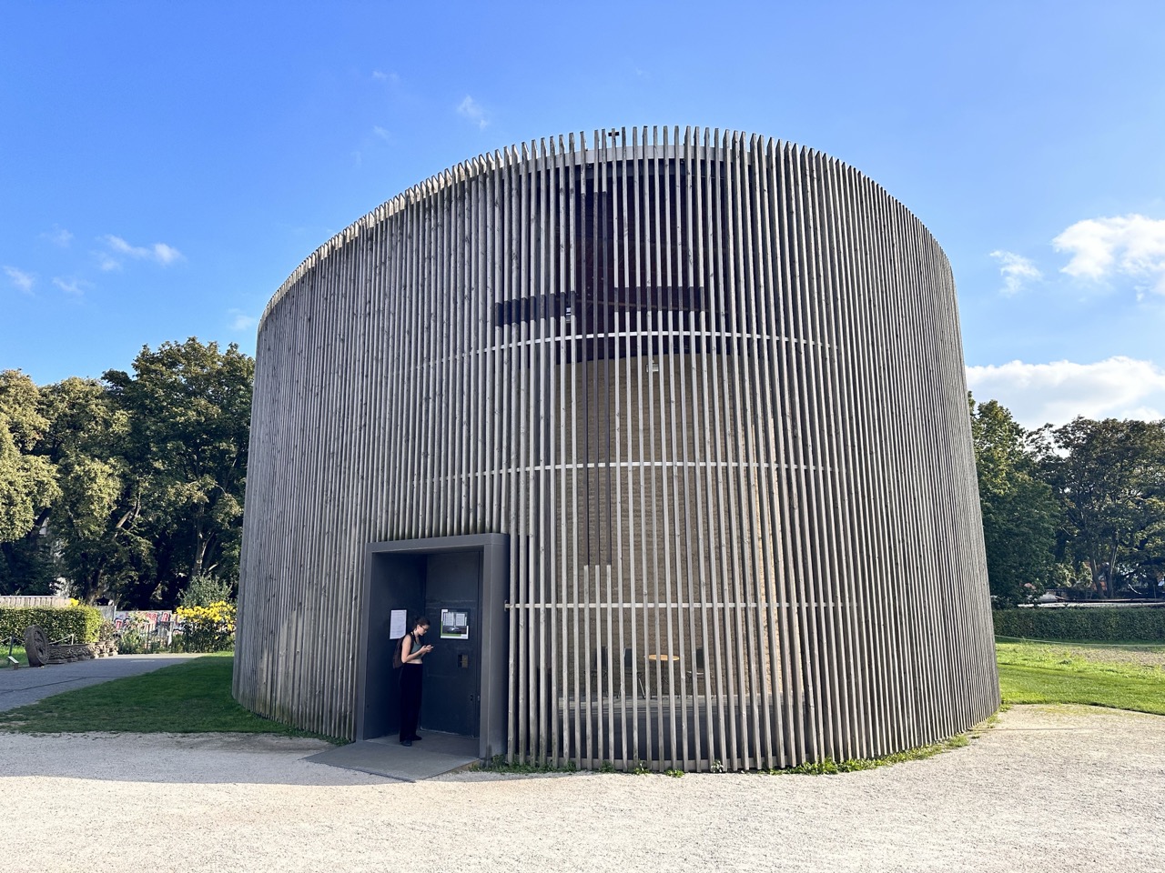
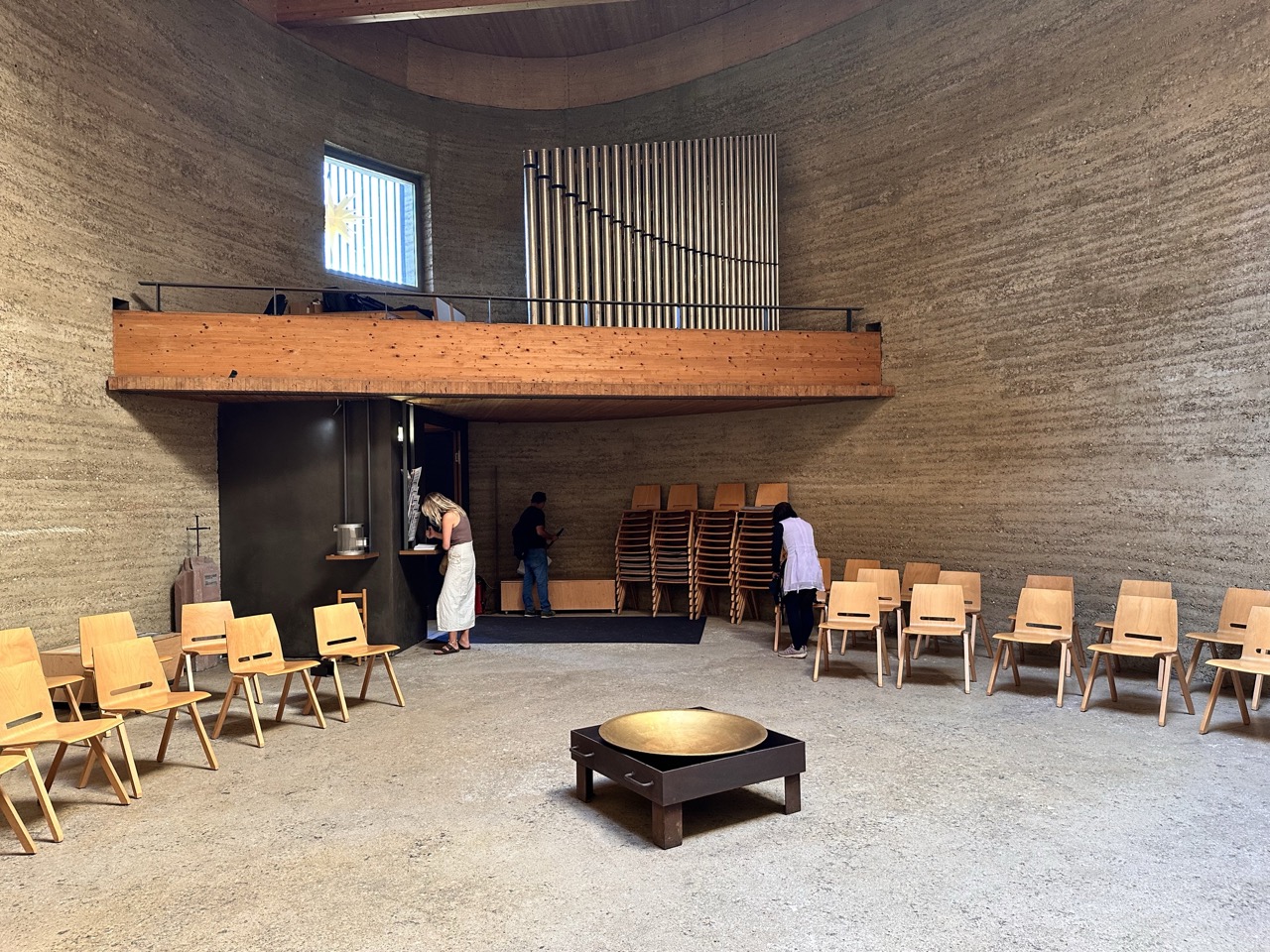
The building, standing seven meters high as one story, is unusually shaped in continuous curves resembling an egg. The exterior façade is clad with vertical wooden louvres. Inside, a rammed earth bearing wall 60cm thick protects the sanctuary. While the design of the buildings bear no resemblance, the exploded rubble of the former church composed the material for this inner wall, providing it visible texture with bits of glass and wood embedded, and a few sculptural pieces remain intact. (A sandstone rondell and capitals from the former church are tucked to the left of the building as seating, now inverted and degrading in the weather.) The floor, one continuous slab many centimeters thick, runs across the entire building and connects with the exterior grille. A ceiling of laminate wood beams similarly spans both the sanctuary and ambulatory.
For the façade, weathered, dimensional lumber is regularly spaced, allowing light and air through into the ambulatory. The boards are mortised and connected through five lap-joint metal (stainless?) bands running horizontally around the perimeter. Each board—continuous for the full height of the structure—ends several centimeters above the ground, with a miter edge at the base to flow water toward a drip edge. (Underneath, the water flow has led to dandelions growing, which I imagine in the spring would bloom into a garland for the building.) Water from the pitched metal roof’s drain points descends through pipes accompanying the structural posts immediately inside the grille, alongside lightning rods connected to the topmost metal band. Though the wall and floor weigh hundreds of tons, keeping the grille noticeably above the ground gives the building a mild feeling of floating and lightness, aided by the continuous lines upwards.
There is no singular guiding idea of the façade: though its construction appears simple, it marries multiple abstract ideas and construction needs into a distinctive shell. From the outside, the protective wall makes the building a conundrum, and combined with the interior wall, prevents seeing activity inside. The grille lets the outside light and air in, while maintaining privacy and symbolically protecting the community inside, with its dedication to prayer. This protection is justified: considering the former church was corrupted through a military takeover during the Cold War, becoming a site of surveillance and violence, this walled garden creates breathtaking serenity inside it. There’s an ecclesiastical connotation, since in cloistered (Catholic) monasteries, grilles mediate conversation with monastics. Next to the Berlin Wall memorial, with its hundreds of rusted rods, the vertical louvers’ lines echo the wall memorial sculpture. Inside, the pipes of the lofted 1965 Walcker organ continue the vertical rhythm motif. This mirroring of inside and out is evident across the building.
Another theme consistent across the site is concealment. The shape of the building itself is not clear from walking around its perimeter: its roundness is obvious, but it’s not circular. The building lacks a traditional spire, though the previous one, dramatically deformed in the explosion, rests a few meters away as a sculptural installation. The building carries no visible name or sign. Instead, a large cross is subtly stained onto the wooden slats, reminiscent of the painting “Black Cross” by New York artist Ad Reinhardt. Being tall, high up, and unlit, a visitor cannot see this symbol when close to the building, from the inside, in the dark, or when not facing the entrance. The egg shape of the building and lack of spire makes the church lack traditional ecclesiastical markings, in contrast to its predecessor.
Concealment continues through the doorways. Inside, after walking halfway to the back, a wood-paneled entrance intermediates flow into the sanctuary, with a concealed door (presumably with a tight staircase) leading to the organ loft. A concealed (locked) door is built into the right side of the apse. At the back of the building is a functional service door, open to the public when the front door is, constructed of the façade but designed to blend in with a short horizontal break in the grilles for the door to swing.
The primary entrance, however, is obvious. To enter the building, an accessible ramp from the gravel leads briefly to heavy double doors made of blackened steel. The welded doorway protrudes from the building exterior, with a negative space offering mild protection in front of the doors. Cylindrical handles made of architectural bronze cross a square cutout space in each door; these cutouts, resembling espresso knock boxes, offer a further glimpse inside. When the church is closed—volunteers from the church loosely follow a limited schedule of opening it—the entrance is foreboding, yet reveals alluring light from the inside.
The lighting of the church tells many stories. Stepping inside, when there’s direct sunlight, the regularly-repeating slats create sharp shadows grating across the neutral floor of the ambulatory and the inner wall. While outwardly-facing floodlights are hung inside, around a meter from the ceiling at regular intervals, they’re not illuminated at night, a missed opportunity to my eyes. The building is notably not lit from the ground outside either, the most straightforward way to light a symbolic building formerly seen across the Wall. Inside the sanctuary, a large 3-pane skylight over the baptismal font provides primary illumination, alongside clerestory windows that shed diffused light down the apse and into the room. A window in the inner wall highlights a sunlit, stellate polyhedron hanging in the ambulatory, like a polygonal take on Dale Chihuly’s “Sunburst” glass sculpture, in this context evoking the Star of Bethlehem. The star’s bright yellow color joins the natural hues of the earth, weathered slats, and brown wood tones of the ceiling to create a feeling of light and warmth.
The building is not uncompromising. The skylight inside is mounted in a box made of plywood panels screwed together that stands out against the wood beam ceiling. Behind the building, a shipping container butts up against the exterior, covered in graffiti and padlocked, indicating a storage or utility need the building failed to cover. Electricity runs through the building, but the artificial illumination is likely intentionally limited. The building lacks a heating system, so churchgoers may be warmed in low temperatures only by the community’s natural heat, aided by the insulation of the earthen wall.
“Reconciliation” is a ripe term, to which the reconstructed chapel adds rich meaning. As the property stands on glacial deposits, bringing the natural materials of the area—sand, clay soil, stone, wood—to the building maintains harmony with the landscape, which a “modern” construction of steel and glass would not. The surrounding fields of rye, planted nearly two decades ago, signal the renewal. The reconstruction using rubble from the predecessor, now as the element bringing shelter to today’s community, grapple with the legacy, without feeling stuck in any styling of the original. With daily remembrances at the chapel for those lost to the Berlin Wall, their memories live on, just behind the wooden slats.

